Building a source of truth for entertainment platform
Project
In-house Design systems
Credit
Ross Gibson - DS Manager
Rafael Rojas- Software Engineer
Rina Krevat - Software Engineer
Dave Medina & Liv Califano - Product
What I did
Design System
Strategy
Component Design
Mentoring
Front-End-UI
Tooling
Documentation
Platforms
Web
iOS/tvOS
Android/GoogleTV/FireTV
Roku
Android Auto
SmartTV
Low-powered Devices
Paramount+ is an American subscription video on-demand over-the-top
streaming service owned by Paramount Global. As the first designer in our company's Design Systems, I
spearheaded the initiative to build our design system from the ground up. My journey began with the creation of
design tokens and component designs, developing strategies to ensure consistency and scalability across our
products.
I collaborated closely with DS Manager, developers and DevOps teams to set up the design system
repository and establish pipelines to efficiently ship packages. My role encompassed a wide range of
responsibilities and this case study explores these responsibilities.
Establishing a Design Systems Team
Collaborating with my manager, we assembled a team with diverse skills to ensure consistency and scalability.
Team Composition
- DS Manager: Sets the design direction and aligns with brand values.
- Design Systems Designer: Ensures consistency and scalability of design components.
- Engineering: Transforms design concepts into functional components.
- Product Management: Aligns the design system with business goals and manages priorities.
Collaborative Approach
- Project Planning: Created a comprehensive project plan.
- Setting Milestones: Established clear milestones to ensure timely progress.
- Defining Deliverables: Outlined specific deliverables for each phase.
- Continuous Review: Maintained a feedback loop for regular reviews and adjustments.
With the team in place, our next step was to chart out our course of action. This starts with:
Research
We conducted internal surveys and interviews with designers and developers, focusing on pain points in the existing workflow. We analyzed feedback and collected data on time spent on design-related tasks and the frequency of design-related bugs.
Key challenges identified were:
- Inconsistency Across Platforms: Maintaining a unified look and feel across different platforms is difficult.
- Collaboration Hurdles: Miscommunication between designers and developers due to the absence of standardized documentation.
- Hard-Coded Design Elements: Inefficiencies due to the use of hard-coded design values.
- Inconsistent Design Implementations: Lack of clear guidelines led to variations in design implementation across projects.
To address these challenges, we explored different solutions. This case study explores the implementation of those solutions.
Streamlining a Design System
Recognizing the potential of streamlining our design-to-development workflow, our team, alongside our talented front-end developer, embarked on building a comprehensive Design System (DS) repository on GitHub with integrated automation.
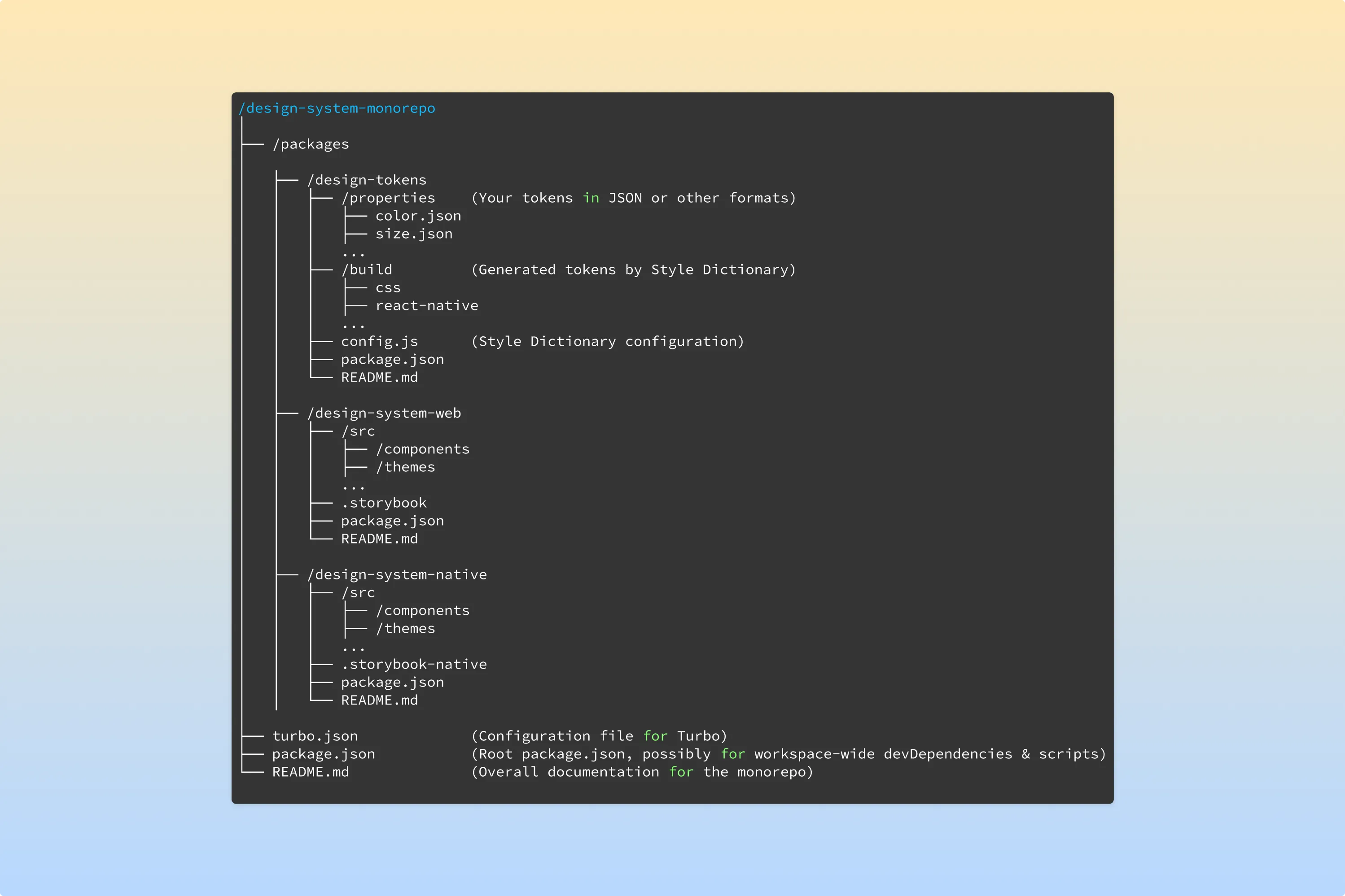
Processs
- Figma Design Creation: Our journey started in Figma, where design components were meticulously crafted, ensuring they captured our brand's essence while being functional.
- Token Extraction & Style Asset Generation: Once the designs were finalized, the magic of automation began. Using the power of Style Dictionary, we extracted design tokens and generated essential style assets seamlessly.
- Component Creation: With style assets in hand, the focus shifted to development. Reusable components were created for platforms, encapsulating the design principles and ensuring reusability across projects.
- Storybook Rendering for Web: Before being merged into the main codebase, every component was rendered using Storybook. This step ensured visual consistency and functionality. Additionally, integrating with a mono repo setup allowed for streamlined management of our components, enhancing collaboration.
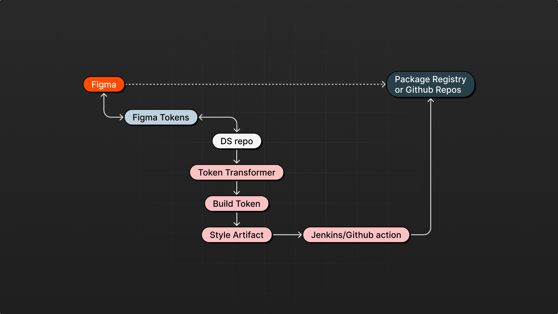
- Unit and Regression Testing: The unit and regression tests to ensure our components' robustness and reliability. This pivotal step ensured that new additions or modifications did not inadvertently break existing functionalities.
- Automated Publishing: The final step involved automation tools pushing our components/styles as packages to NPM or other repo, ensuring that other teams and projects could easily incorporate and benefit from our design system.
Results
- Consistency Across Boards: With design tokens and automated pipelines, we've eliminated manual errors and ensured uniformity in design and code.
- Simplified Management: The mono-repo structure, combined with automation, means less manual oversight and more efficient component management.
- Efficient Updates: Changes or updates can be rolled out swiftly, ensuring that every projects using our packages is always up-to-date.
Crafting a Design Token System
Consistency is the key to creating products that resonate with users. Yet, maintaining that consistency, especially across multiple platforms, can be challenging. To address this, we embarked on a journey to establish a design token system that would define the visual style of our products through decision values. Design tokens were introduced as a scalable set of variables (like colors, typography, spacing etc.) stored in a JSON format, facilitating consistency and easier management of design systems.
Tools and Technologies
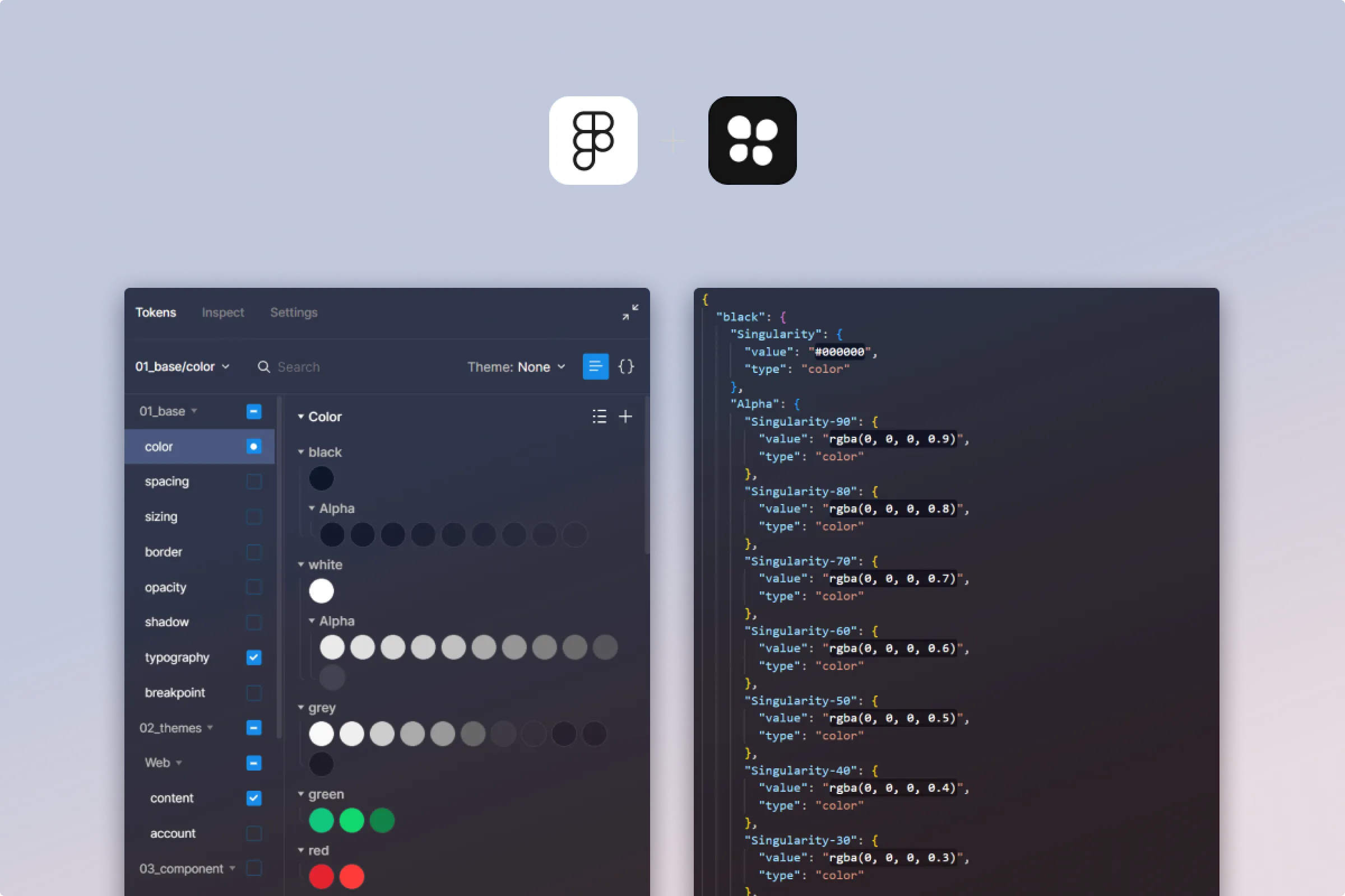
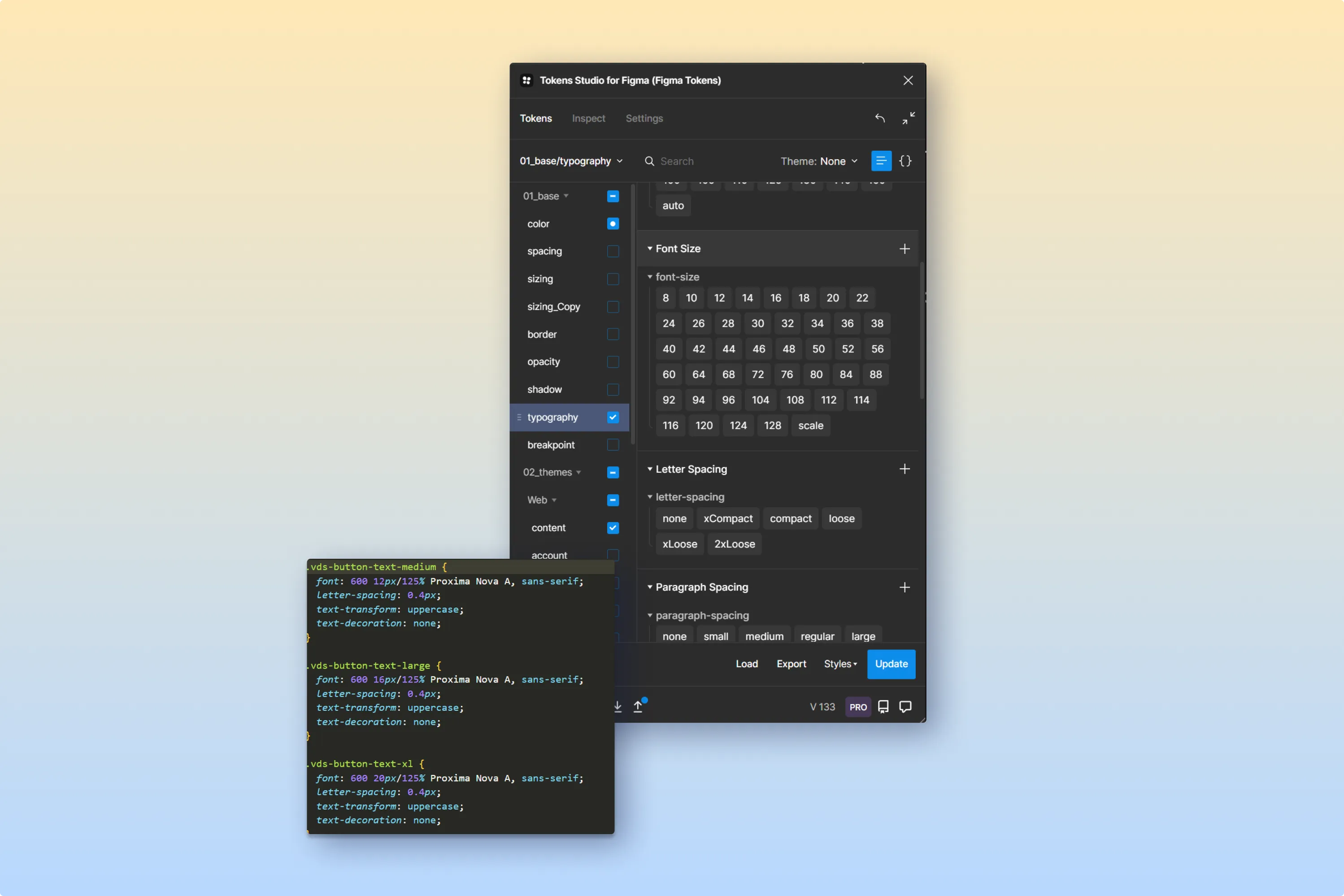
We used Figma for design creation, with a Figma Token Plugin to extract design tokens in JSON. These tokens were then converted into platform-specific styles using Style Dictionary.
- Intentional Style Crafting: With the assistance of the Figma token plugin, we didn't just create styles; we sculpted them. Every design choice was made intentionally and precisely, ensuring alignment with our brand's ethos.
- Systematic Token Naming: Our token naming strategy was logical and structured (C=Category, T=Type, I=Item), relying on clear categories, properties, variants, and modifiers. This systematic approach made tokens easily identifiable, usable, and modifiable, streamlining the design-to-development handoff.
- Seamless Export and Integration: After refining our styles to perfection, the export process was a breeze. Styles were effortlessly converted into JSON files, then integrated into our mono repo. This ensured that our design values were readily available for developers, bridging the gap between design ideation and code implementation.
Implementation of Design Tokens
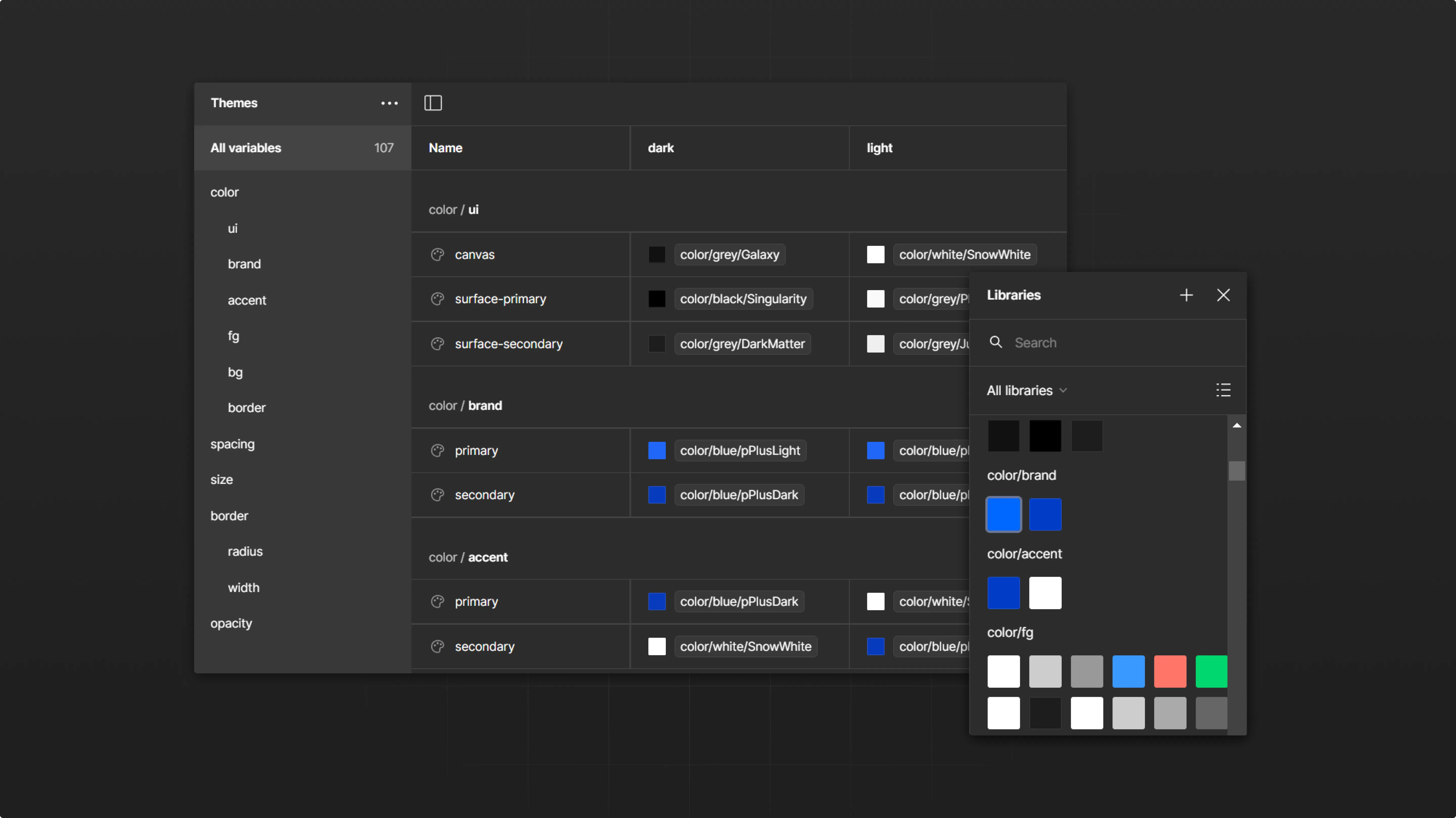
In Figma, after defining and organizing variables (colors, typography, spacing) in a shared library, they are ready to use in designs.
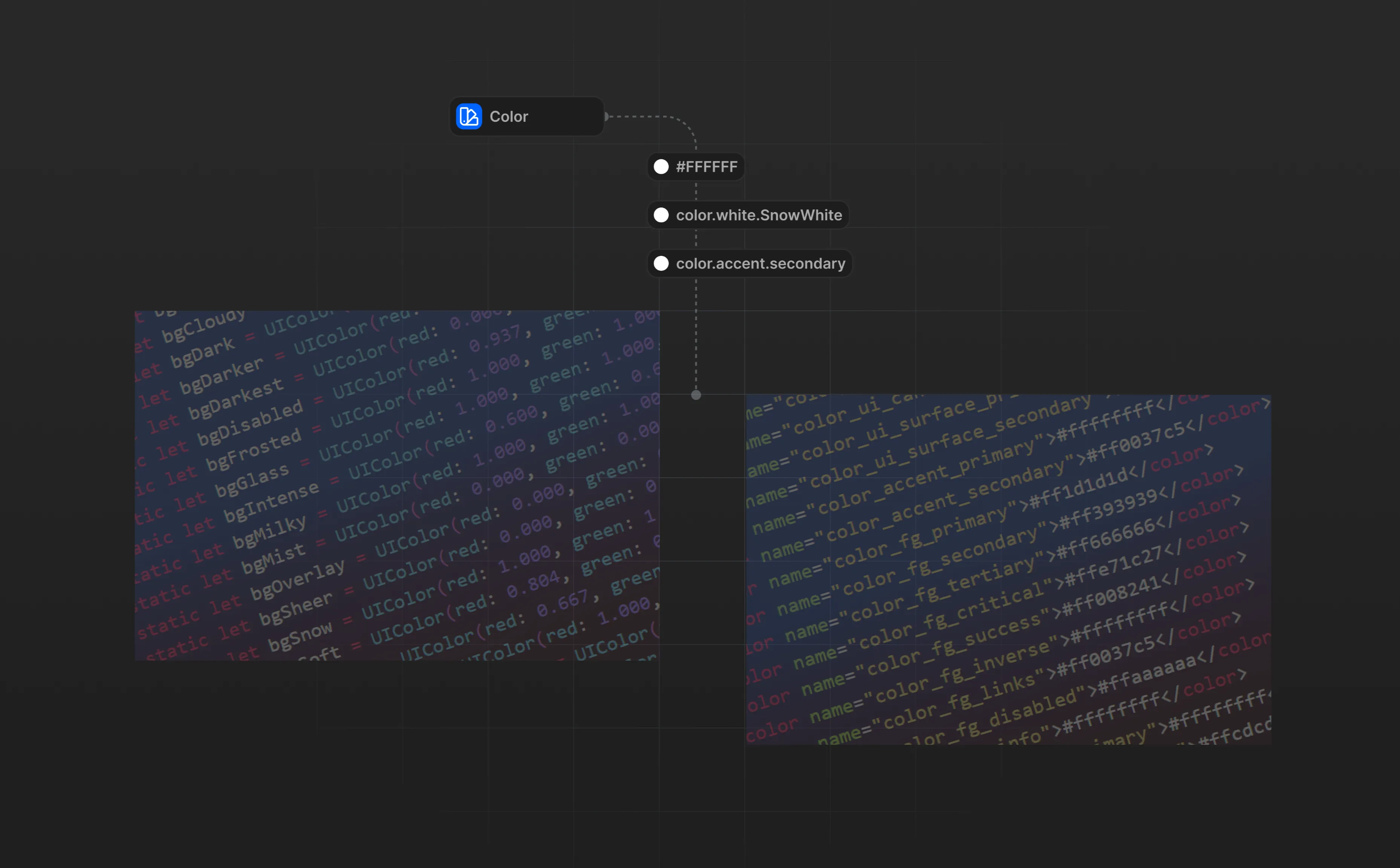
On the development end, these JSON files were used to generate platform-specific resources. For Web, CSS variable, For iOS, this meant generating color sets for use in Xcode, while for Android, XML color resources were created.
The implementation involved:
- Integration: Transforming design tokens to web, iOS, and Android native styles.
- Overcoming Challenges: Addressing initial resistance and learning curve.
- Improved Collaboration: Enhanced designer-developer collaboration due to clearer communication.
Results
- Implementing design tokens led to improved design consistency and team collaboration.
- Our workflow has seen a marked improvement in efficiency. No more second-guessing design choices or discrepancies across platforms.
- We've established a consistent and reusable system, ensuring our products look and feel top-notch, regardless of where they're accessed.
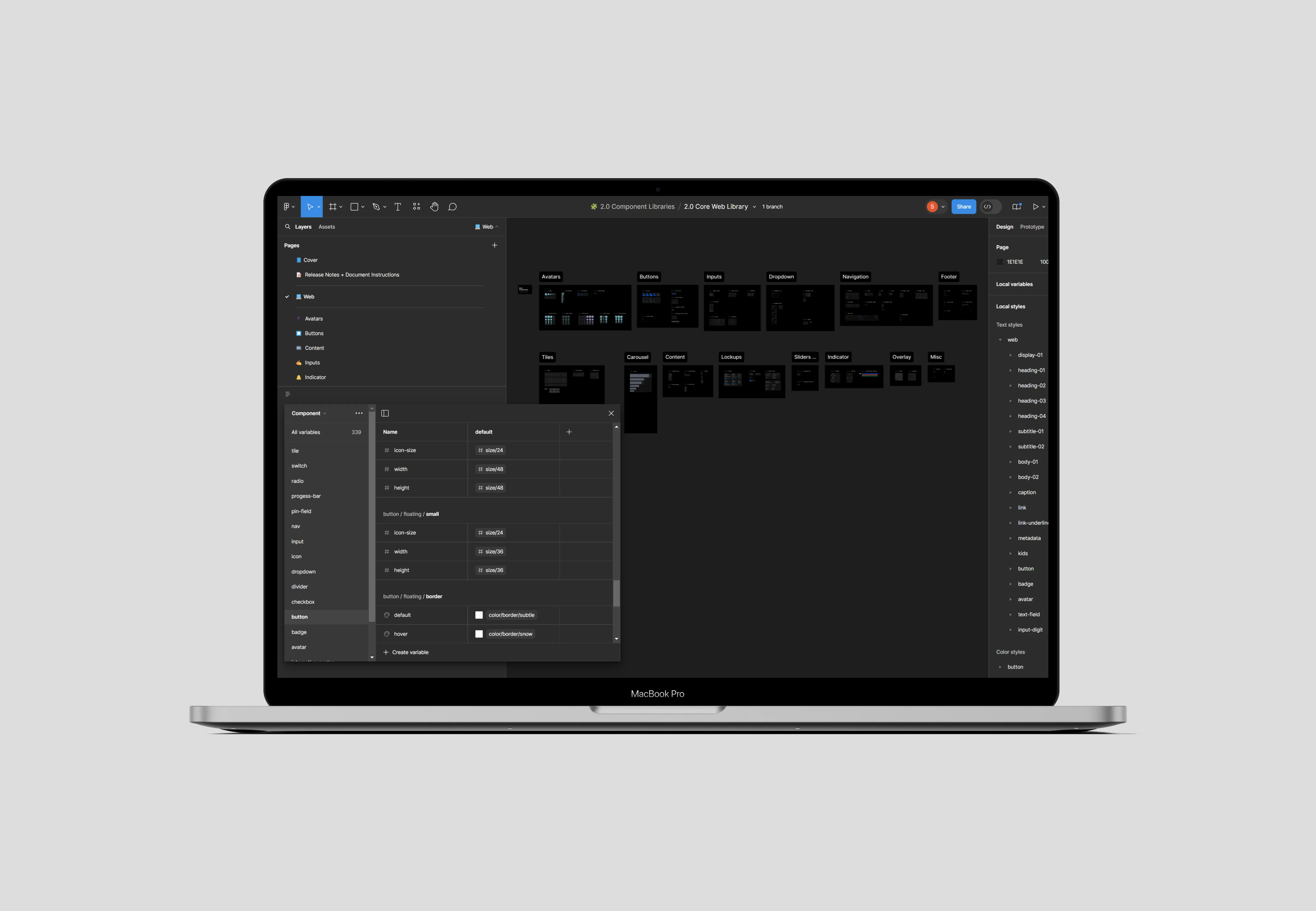
Developing Components for Multiple Platforms Using Figma Variables
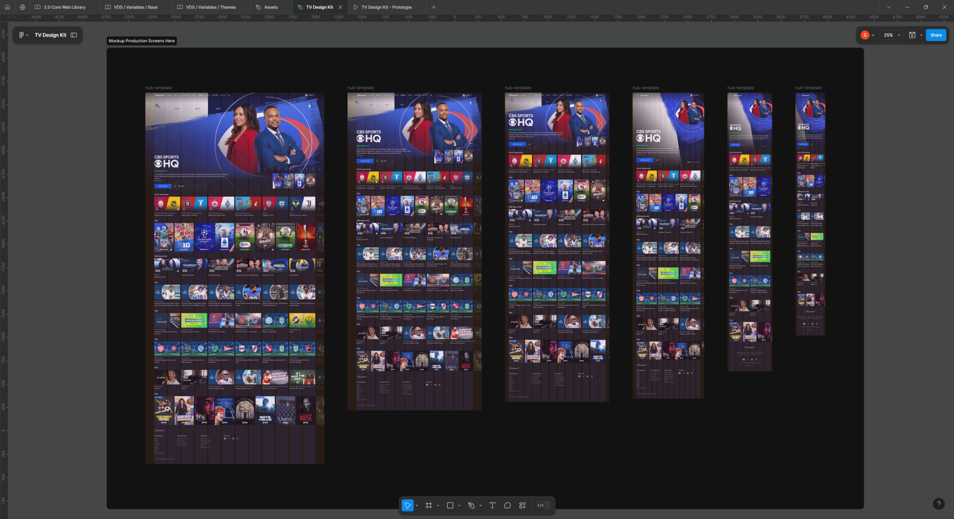
By leveraging Figma’s design features and collaborating closely with developers, we were able to create scalable, reusable components that could be implemented across multiple platforms while maintaining design consistency and performance.
Challenges
- Platform-Specific Behavior: Each platform (web, iOS, Android, Roku and other OTT platforms) requires different interaction patterns and design guidelines, making it difficult to create a unified component library.
- Component Flexibility: Components needed to be adaptable for different screen sizes, orientations, and states while maintaining consistency.
- Complex Interactions: Building components that supported complex interactions, such as hover states, tap feedback, and dynamic content changes.
- Collaboration and Handoff: Ensuring a smooth handoff between design and development, where developers could easily implement the components in code.
Solution
Tools and Technologies:
- Figma Variables: Used to introduce dynamic properties to components. Integrated design tokens for consistent implementation of colors, typography, and spacing across all platforms.
- Component Variants: Created component variants for different states (default, hover, active) and platform-specific needs.
- Prototype Interactivity: Utilized Figma’s prototyping capabilities to simulate real interactions like button presses, animations, and feedback responses.
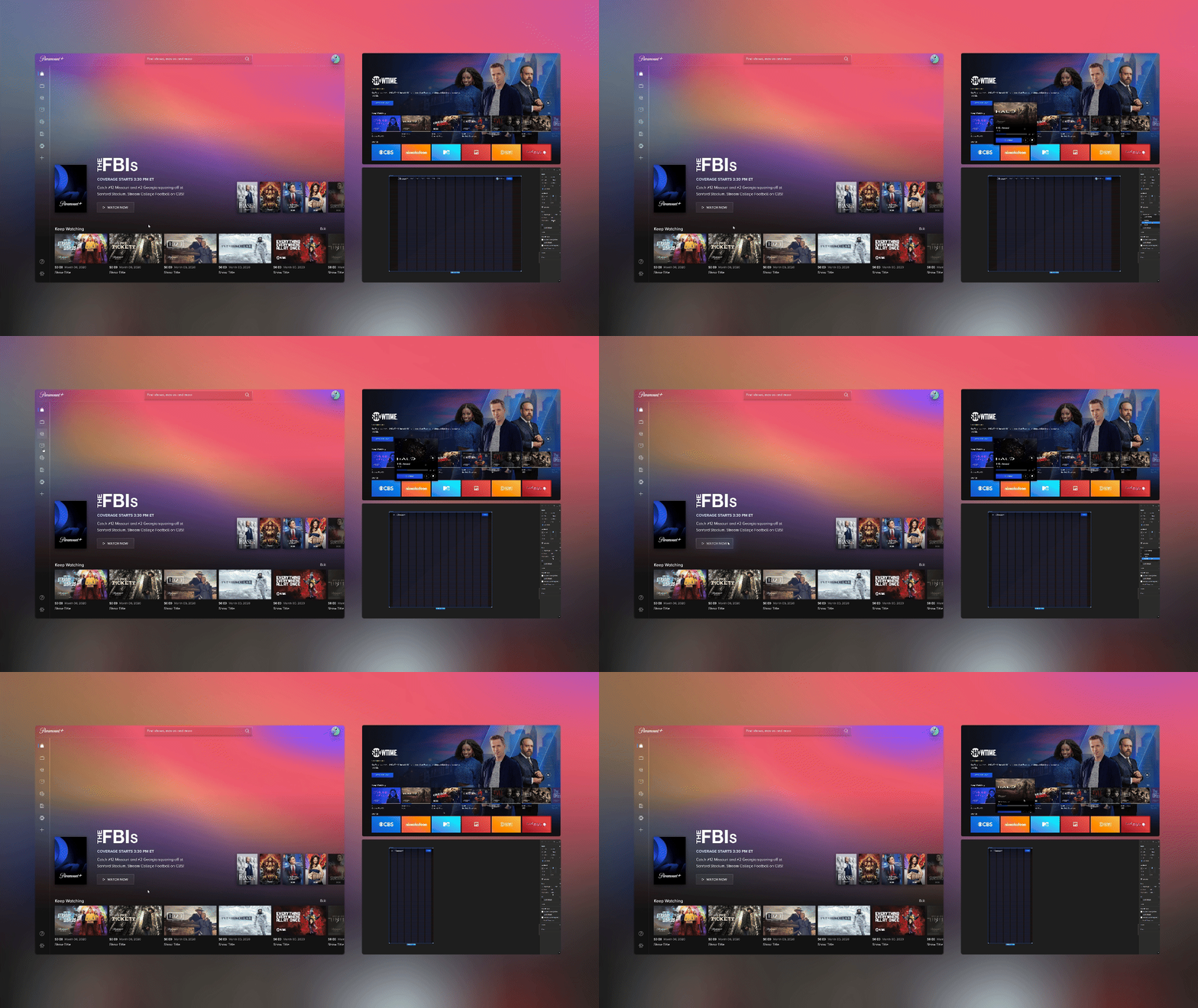
Process Overview
- Design Component Framework: Created a framework in Figma where each component could be adjusted using Figma variables (e.g., color, text, size), allowing for easy customization and consistency across platforms.
- Component Variants for Platform-Specific Needs: Designed component variants for web, iOS, tvOS and Android, GoogleTV, Amazon FireTV, Roku, Consoles, TV Box, Smart TVs to adhere to platform-specific design guidelines while using the same core structure.
- Interactive Prototyping: Used Figma’s prototype tools to simulate interactivity, ensuring each component’s interactions (e.g., hover states, tap feedback) felt natural across all platforms.
- Collaboration with Development: Worked closely with developers to ensure the components were easily transferable to code. Figma’s inspect feature allowed developers to extract relevant design tokens and code snippets, streamlining the process.
- User Testing and Iteration: Conducted usability testing of the components to ensure they performed well across all platforms. Iterated based on feedback from both users and developers.
Results
The implementation of components using Figma variables led to several key improvements:
- Ensured visual and interaction consistency across web, iOS, tvOS and Android, AndroidTV, Amazon FireTV, Roku, reducing discrepancies between platforms.
- The use of Figma variables allowed components to be easily adapted to different contexts, screen sizes, and states without redesigning from scratch.
- The clear documentation and use of design tokens facilitated a smoother handoff between designers and developers, reducing errors in implementation.
- Figma’s prototyping features enabled rapid testing of interactions and designs, allowing for quick iteration and refinement.
Streamlining Figma Libraries
Experiencing rapid team growth, we recognize the importance of efficiently managing Figma Libraries. These libraries form the core of the daily operations for our design team, which includes 15+ Product Designers. The team's extensive weekly use of thousands of components underscores the need for meticulous organization and maintenance of these libraries.
Challenges
The primary challenge was keeping the Figma Libraries clean, well-organized, and accessible. Initially, all components were housed in a single file, leading to accidental deletions, overrides, and misalignments. Additionally, the team grappled with decisions on component usage and sharing and managing components not intended for development.
Solution
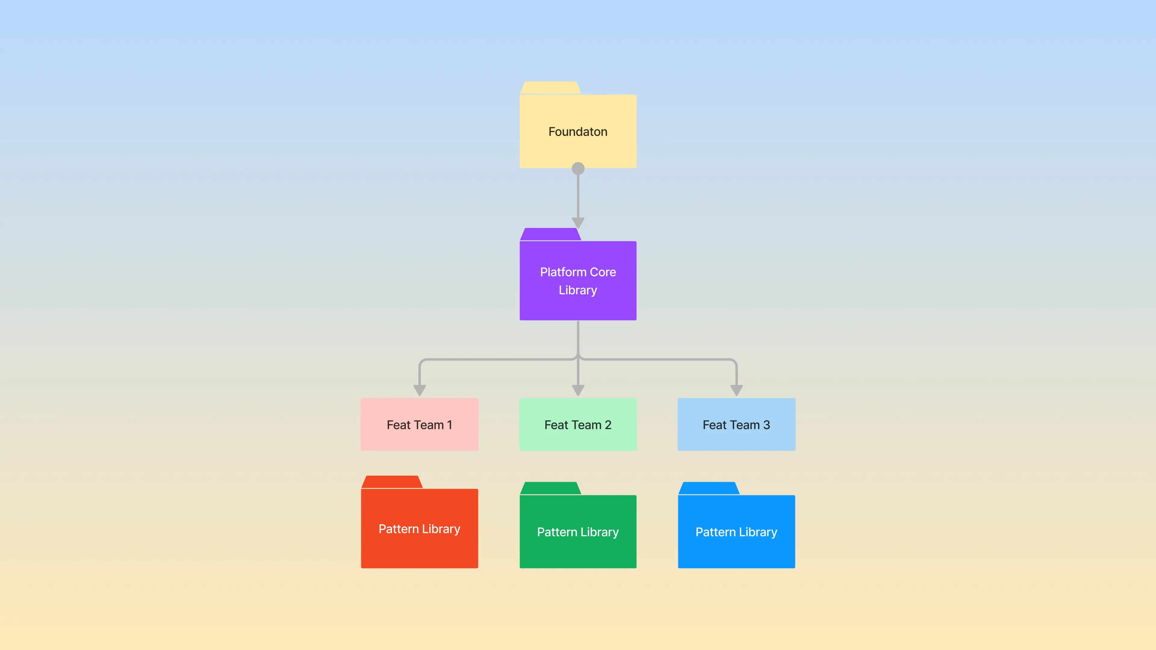
Splitting Components into Base and Pattern:
- Foundation: Includes styles, assets and variables that power all components.
- Base Components: Generic components developed and used in production, including UI kit elements and workflow-enhancing tools.
- Pattern Components: Figma-specific templates and organisms designed to optimize Product Designers' workflows. Design teams individually manage these components.
Results
This revamped structure led to significant enhancements in managing and utilizing Figma Libraries, evidenced by:
- Clearer component ownership and responsibility.
- Improved efficiency in locating and using components .
- Facilitation of modular component creation, reducing design and technical debts.
- Continuous innovation and updates in the Playground file.
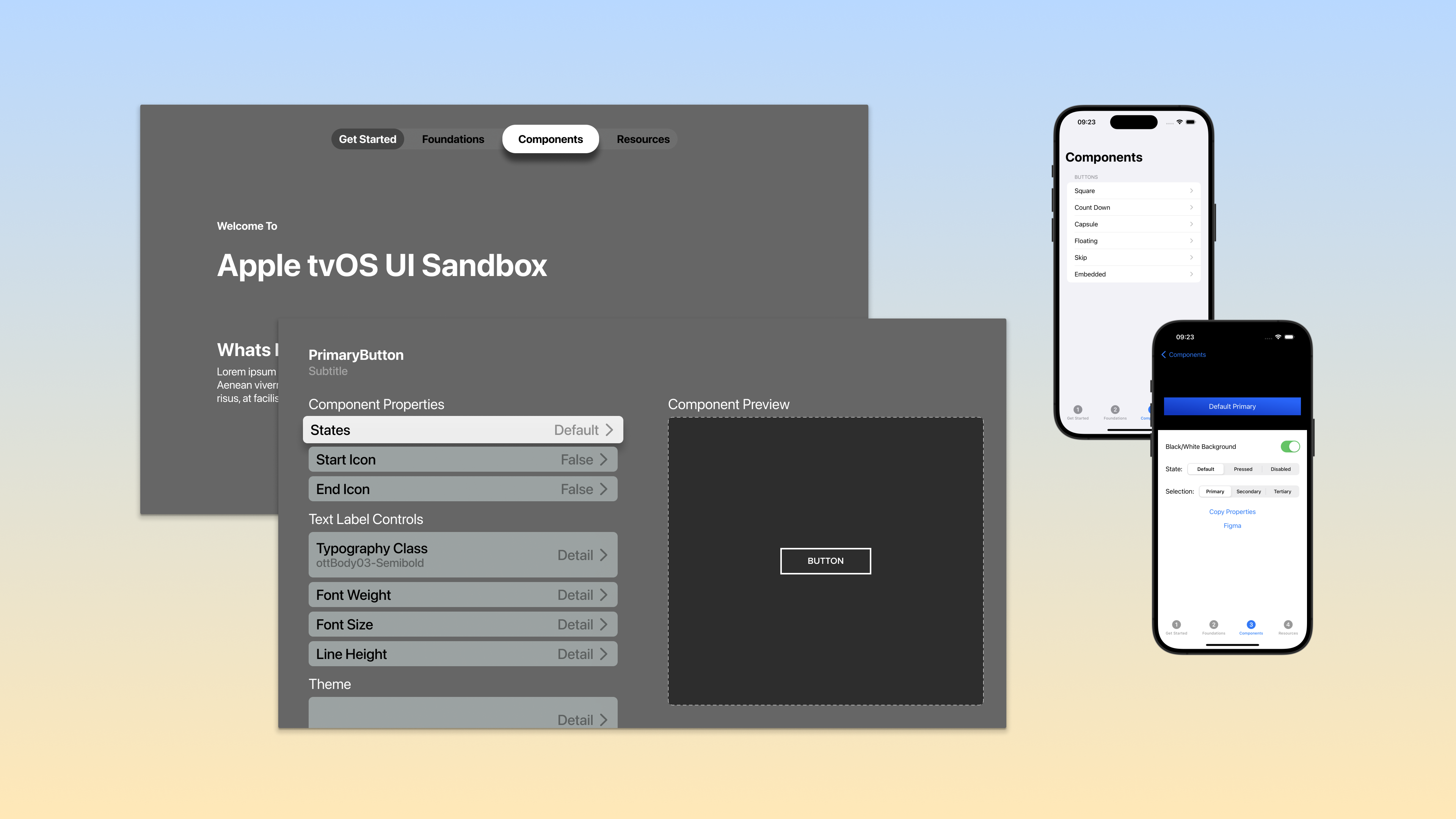
Creating Comprehensive Documentation
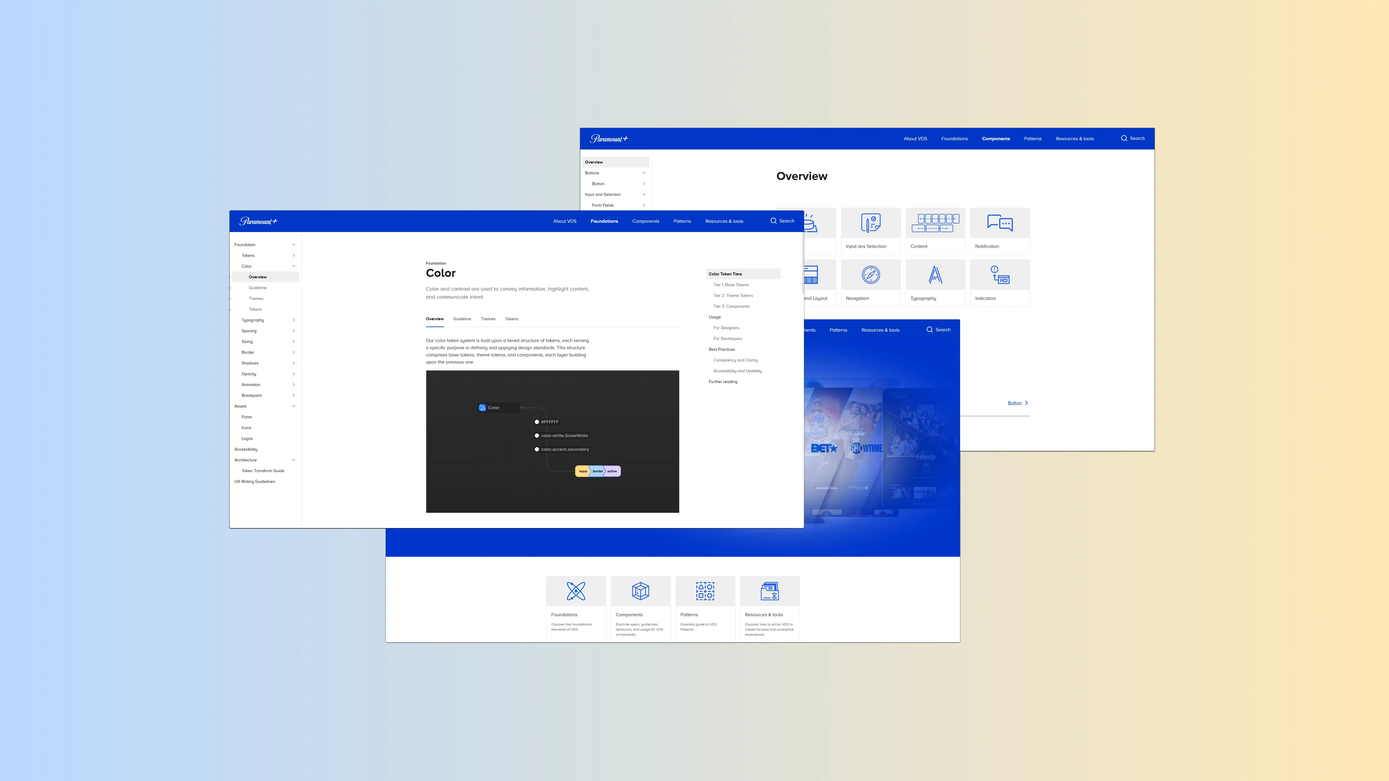
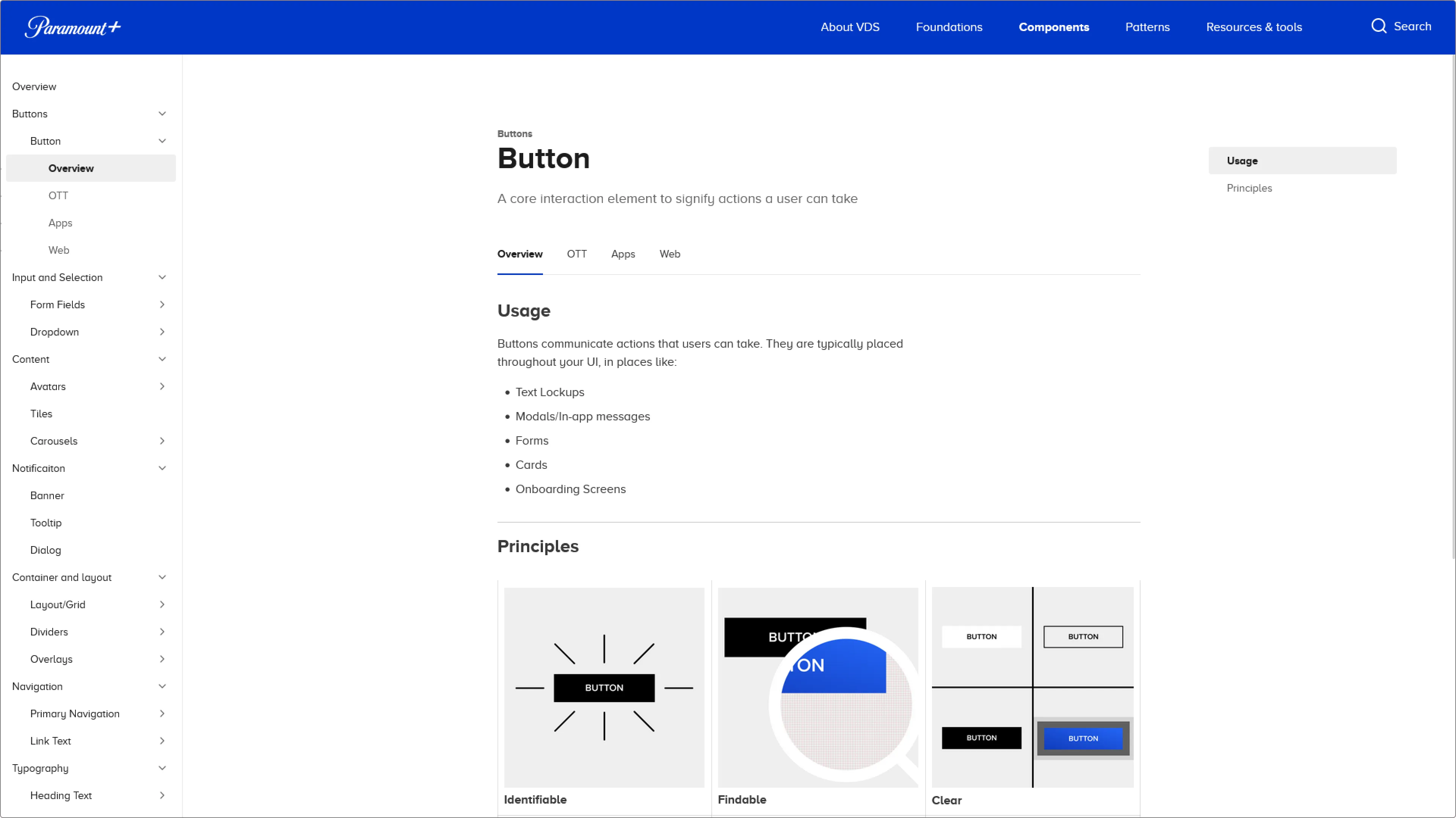
We identified the need to restructure and redefine our documentation to support new tokens and component documentation within our expanding design systems.
Process
- Establish Documentation Structure: Defined a clear and intuitive structure for the documentation, including sections for design principles, component guidelines, usage examples, and code snippets.
- Collaborative Writing: Engaged cross-functional teams to contribute to the documentation, ensuring comprehensive coverage of all aspects of the design system.
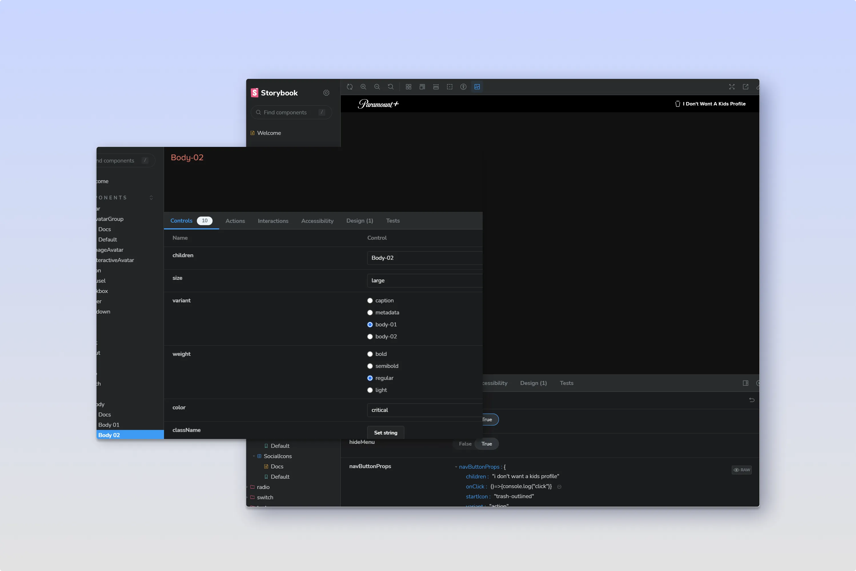
- Interactive Examples: Incorporated interactive examples and live code snippets using Storybook to make the documentation more engaging and practical.
- Accessibility and Searchability: Ensured the documentation was easily accessible and searchable, enabling quick reference and usage.
Results
The implementation of comprehensive documentation resulted in the following:
- Enhanced Consistency: Improved consistency in design implementation across projects and platforms.
- Streamlined Collaboration: Better communication and collaboration between designers and developers, reducing misunderstandings and rework.
- Efficient Onboarding: Reduced onboarding time for new team members by providing clear and structured documentation.
- Easier Maintenance: Simplified the process of updating design systems and components, ensuring they remain up-to-date.
Key Learnings
Creating a comprehensive design system is a highly challenging endeavor.
- Flexibility and Adaptability: Being open to changes and ready to adapt strategies based on feedback and new challenges ensures continuous improvement.
- Proactive Stakeholder Management: Engaging stakeholders early and addressing their concerns fosters buy-in and smoother adoption of new systems.
- Training Enhances Adoption: Providing thorough training and ongoing support helps team members adapt to new processes and tools more effectively.
By establishing a dedicated team, automating workflows, and maintaining clear documentation are crucial steps to ensure the successful development and implementation of a scalable, user-centric design system. If you are reading this, Thank you.